
Meta Description: Your comprehensive guide to choosing interior design colors. Learn about the psychological impact of color, the 60-30-10 rule, and the best colors for every room. Harmonie Interiors – We help you choose the perfect color palette.
Keywords: Color selection, interior design colors, bedroom colors, kitchen colors, living room colors, color coordination, color palette
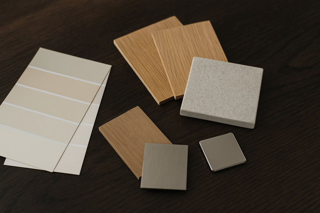
Introduction
Choosing the right colors is one of the most important steps in interior design, as it directly affects mood and the overall feel of a space. The wrong color can make a spacious room feel cramped, or a comfortable space feel cold and unwelcoming. Conversely, the right color can transform any space into a comfortable haven that reflects your personality and meets your needs.
At Harmonie Interiors, we choose color combinations that align with the client’s personality and the function of the space. We don’t rely on fleeting trends, but rather on a deep understanding of color theory and its psychological impact.
Our Philosophy: We believe that colors tell the story of a space. Every project begins with the question: “What feeling do you want this space to evoke?” The answer guides us in choosing the right color palette.
The Impact of Colors on Psychology
Before choosing colors, we must understand how they affect us psychologically. This isn’t just theory—scientific studies prove that colors affect blood pressure, heart rate, and even appetite!
Warm Colors
Red
- Stimulates energy, enthusiasm, and passion
- Encourages appetite (that’s why restaurants like McDonald’s and KFC use it)
- Can be overwhelming if used too much
- Ideal for: Accents in living rooms or dining rooms
Orange
- Gives a feeling of warmth and vitality
- Stimulates creativity and social interaction
- Ideal for family spaces
- Ideal for: Playrooms, kitchens, dining rooms
Yellow
- Radiates optimism and happiness
- Energizes the mind and improves mood
- Bright shades can be tiring for the eyes
- Ideal for: Kitchens, hallways, breakfast rooms
From our projects: In designing a kitchen for a family in Düsseldorf, we used mustard yellow as an accent on the chairs only. The result: A kitchen full of energy without being overwhelming. The client told us she now enjoys cooking even more!
Cool Colors
Blue
- Calms nerves and lowers blood pressure
- Enhances focus and productivity
- Can appear cold if not balanced with warm colors
- Ideal for: bedrooms, bathrooms, offices
Green
- The color of nature, giving a sense of balance and freshness
- Easy on the eyes and does not cause strain
- Suitable for most rooms
- Ideal for: living rooms, bedrooms, bathrooms
Purple
- Gives a sense of luxury and sophistication
- Lighter shades (lavender) are calming
- Darker shades add drama
- Ideal for: bedrooms, luxurious living rooms
Our Tip: Olive Green has become one of our favorite colors at Harmonie Interiors. We use it frequently in kitchen cabinets because it combines warmth and elegance and pairs beautifully with wood and marble.
Neutral Colors
White
- Gives spaciousness, purity, and brightness
- Reflects light and visually enlarges a space
- Can appear cold or “hospital” when used alone
- Ideal for: ceilings, walls as a backdrop, small spaces
Beige and Cream
- The warmth of white without its coldness
- Versatile and coordinates with most colors
- Creates a sense of comfort and welcome
- Ideal for: any room in the house
Gray
- Modern and neutral elegance
- Ranges from bright light to dramatic dark
- Needs accent colors to avoid monotony
- Ideal for: living rooms, modern bedrooms
Black
- Luxury, drama, and depth
- Should be used sparingly and as accents
- Highlights other colors
- Ideal for: details, frames, and accents
Basic Rules for Choosing Colors
- Understand the Function of the Room
Every room has a different purpose, and color should support that purpose:
| Room | Function | Suitable Colors |
|——–|———|——————|
| Bedroom | Rest and Relaxation | Blue, Green, Beige, Light Gray |
| Kitchen | Activity and Cleanliness | White, Yellow, Light Green, Gray |
| Living Room | Warmth and Welcome | Beige, Warm Gray, Earth Tones |
| Office | Focus and Productivity | Blue, Green, Gray |
| Nursery | Fun and Creativity | Stimulating but Subtle Colors |
- Consider Lighting
Lighting completely changes the appearance of color! The same color looks different in:
Natural lighting:
- North-facing rooms: need warm colors to counteract the cool light.
- South-facing rooms: tolerate cool colors because the light is warm.
Artificial lighting:
- Warm white (3000K): warms up colors.
- Cool white (5000K): cools down colors.
For more on lighting, read: Modern Gypsum Board Designs for Elegant Spaces
Golden tip: Buy a small paint sample pot and test it on a large wall (at least 50 x 50 cm). Observe it at different times: morning with sunlight, midday, and evening with artificial light. You’ll be amazed at how the color changes!
- The 60-30-10 Rule
A simple, golden rule for color distribution that we use in all our projects:
- 60% primary color (walls, floors, and large pieces)
- 30% secondary color (furniture, curtains, rugs)
- 10% complementary color (accessories, cushions, artwork)
A practical example from our projects:
A living room we designed in Cologne:
- 60%: Warm beige walls + light wood flooring
- 30%: Gray sofa + cream curtains + beige rug
- 10%: Indigo cushions + gold vases + artwork
The result: A balanced and comfortable space without boredom or clutter.
- Using the Color Wheel
The color wheel is an essential tool for understanding color harmony:
Analogous Colors:
Colors next to each other
Choosing Colors Based on Space Size
Small Spaces
In Germany, many apartments are small, and here are our tips:
- Use light colors to visually expand the space.
- Make the ceiling lighter than the walls (or the same color).
- Use only one or two colors.
- Avoid dark colors in large areas.
- Use mirrors to reflect light and color.
A trick we use: In small apartments, paint the walls and ceiling the same light color. This eliminates visual boundaries and makes the space appear much larger.
Large Spaces
- You can use darker, more dramatic colors.
- Visually divide the space using different colors.
- Use an accent wall in a bold color.
- Add warmth with earthy tones and wood.
Colors in Specific Rooms
Living Room
The living room is the heart of the home and should be welcoming and comfortable:
Suggested options from our projects:
- Beige + White + Blue Accents (Warm Classic)
- Warm Gray + Cream + Gold Accents (Modern Luxury)
- Olive Green + Beige + Natural Wood (Natural and Comfortable)
Avoid: Very bright or cool colors
Bedroom
A place for rest and relaxation:
Suggested options:
- Light Blue + White + Gray (Calm and Refreshing)
- Beige + Cream + Pink Accents (Warm and Romantic)
- Mint Green + White + Light Wood (Natural and Comfortable)
Avoid: Bright red, bright orange, and bright yellow
Kitchen
An active space that needs energy Cleanliness:
Suggested options:
- White + Gray + Green accents (clean and modern)
- Cream + Natural wood + Black accents (warm and elegant)
- Olive green + Gray marble + Gold (luxurious and distinctive)
Avoid: Dark colors in small kitchens
Bathroom
Needs visual cleanliness with a touch of relaxation:
Suggested options:
- White + Gray + Wood (modern spa)
- Beige + Gold + Marble (luxury hotel)
- Light green + White + Plants (natural and refreshing)
Common mistakes in choosing colors
Avoid these mistakes! For more, read: Common Mistakes During Home Renovation
- Choosing a color from a catalog only
The color looks different on paper than it does on the wall. Solution: Try an actual swatch. - Ignoring existing furniture
If you have furniture that you will keep, choose colors that coordinate with it. Solution: Bring a picture of the furniture when choosing paint. 3. Using too many colors
Too many colors distract the eye. Solution: Stick to a maximum of 3-4 colors. - Ignoring the ceiling and floor
The ceiling and floor are part of the color scheme. Solution: Consider them from the beginning. - Blindly following trends
Trendy colors aren’t necessarily suitable for you. Solution: Choose what suits your taste and lifestyle.
Practical Steps for Choosing Colors
Step 1: Gather Inspiration
- Browse Pinterest and Instagram using keywords like “interior design color palette”
- Save photos of rooms you like
- Note recurring colors in your choices
Step 2: Define the Base Color
- Choose one color you love that suits the room’s function
- This color will comprise 60% of your base color
Step 3: Build Your Color Palette
- Add a secondary color that complements the base color (30%)
- Choose a complementary color for accents and accessories (10%)
Step 4: Test Before Implementing
- Purchase paint samples
- Apply them to a wall (a large enough area is sufficient)
- Observe them for several days in different lighting conditions
Step 5: Implement Gradually
- Start with the walls
- Then add large furniture pieces
- Finally, add accessories (which can be easily changed later)
Conclusion
Colors tell the story of a space, so choose them carefully as they shape its character The spirit of your home. Remember:
- Every color has a psychological effect
- Lighting alters the perception of color
- The 60-30-10 rule is key to balance
- Experimentation before implementation is essential
At Harmonie Interiors, we help you choose the perfect color palette that reflects your personality and suits your space. Don’t hesitate to request a consultation.
Need help choosing colors for your home?
We’re here to help! Contact us for a free color and design consultation.
📞 Phone: +4915753830968
📧 Email: info@harmonie-interiors.de
📍 Address: Von-Liebig-Straße 1, 52531 Übach-Palenberg, Germany